Lighting Tips

Lighting Controls Systems Are Getting More Connected, Here’s How To Keep Up
Connected Lighting Is Here, Now What? Lighting control systems today are evolving as rapidly as...
Read ArticleLighting is wholly different from any other design element of an architectural project. Lighting is an essential element of any project, but quantifying how much a space needs, how it should look and feel and how a given design will accomplish those goals requires a special ability to communicate.
If I mention that something will be 10′ off the floor can you imagine what that will look and feel like in a space? I bet you can. Maybe a basketball hoop comes to mind. Or maybe you’re 5’5″ and so you can imagine something a little less than twice your height. Now picture 30 horizontal foot-candles on a desk surface – can you? Maybe the lighting designers and engineers can, but by and large I bet most people (and certainly most clients) wouldn’t know how to imagine 30 foot-candles. Yet most offices are lit to a 30 foot-candle standard for desktop lighting here in the United States. It’s a light level we see all the time yet most of us can’t necessarily reference it.

Building a visual library of product shots, application photos or even natural light like this has never been easier. There’s no better way to communicate the idea of contrast (for instance) with a client than to show them.
This common frame of reference the biggest challenge to explaining a lighting design. I’ve heard lighting designers pull out all kinds of terms to describe light. Contrast, brightness, soft, harsh, warm, cold, mushy, crisp, direct, indirect and a host of others. To me the most powerful way explain lighting is to build a visual library of references. That could live in an app like Evernote, in a Flickr account, or even an Instagram account – but having a common visual language of light is important if we’re going to explain light to our clients and colleagues.

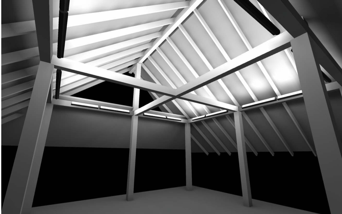
AGI32 Rendering from The Lighting Quotient. Hands down the most thorough applications team in the business.
For all of the lighting designers out there, you can skip this section. You already know the power of applications like AGI32 and DiaLUX for testing and explaining light to clients and colleagues. For everyone else out there…tools like AGI32 and DiaLUX differ from other rendering programs in that they rely on IES files to generate their data. That is critically important because IES files are lab-tested data sets that allow for more realistic renderings. When I see plug-ins for Sketchup or AutoCAD that don’t employ IES files I get scared because while they may create great images they are more conceptual sketches than realistic renderings.
In my experience, when a client sees an image come from a computer they expect it to be photorealistic which is a term I’ve never been crazy about. Renderings are a computer’s best guess at how light will look in a space. While they aren’t perfect, we rely on them everyday to make sure that our clients will understand exactly what will be provided. At SDA we partner with our manufacturers to provide photometric calculations for our clients everyday. They are essential first step to understanding how light will be delivered in a space.

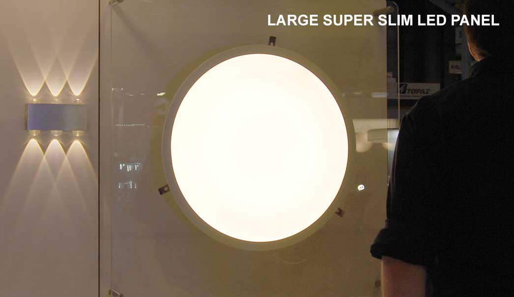
New Super Slim LED Panel from Solvanti. The best way to understand this is to see a demonstration like this one at Lightfair.
There is no better way to really understand how light will look then to test it. Whether that’s a single sample aligned to a wall, or a couple of track lights aimed at a target – understanding how the light will really fall in a space, how it will contour objects and how it will change the feel of a room is most effectively communicated with a mockup. At SDA we work everyday with our clients to organize mockups with up to date samples so that in the end everyone feels comfortable with the system that has been specified.
How do you communicate your design intent to your client? How have you communicated about lighting in the past. Tell us in the comments or on the Facebook page!
Fill out the form below and we'll be in touch as soon as possible.